What do you think of when you see this image? The Golden Arches McD's, Mickey D's, Mackey D's, MDee's, McDicks, Greasy Mac's, Ronald's House... McDonald's.
Whatever name you call it, these two arches will induce some time of brand recognition... and, some type of reaction. Depending on who you are, your reaction may differ. For some, it may elicit ideas of factory farming, low-pay minimum wage jobs, or a slew of other things. But, for many, it symbolizes one thing: Cheap, Fast, Tasty food. But...why? Why does such a simple set of rounded yellow lines elicit such an emotional response? I think the answer's pretty obvious. Marketing. So, let's take a look at McDonald's from an outside perspective.
We'll begin with their website, "McDonalds.com". The internet is a place of immediacy, quick impressions, and short attention for things that don't immediately draw your eye. Let's take a look at how McDonald's website does that. Well, just under the navigation bar is a gigantic slideshow of high quality images, almost taking up the entire screen.
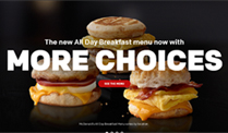
These image's quickly pull the audience in with visual stimulus. Paired with the staged images of their new all day breakfast choices, a pile of potatoes in a burlap sack sitting on a barn floor, and a cup of coffee in a ceramic mug, surrounded by coffee beans and other appetizing ingredients that feel like fall, is a large, moving text.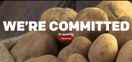 The text is the to make the viewer enticed by McDonald's offers and quality right of the bat. The images behind the text, aren't out of focus, meaning they're meant to be seen, and as a result, meant to impact the viewer. The potatoes are there to show you a very inaccurate scenario of how McDonald's farming practices work.
 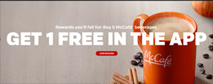 A company on an absolutely global scale moving millions of tonnes of potatoes every day totally uses burlap sacs right? Of course not. It's there to make you feel like McDonald's is somehow a small ma and pa shop, despite really being a giant corporation. Some may consider diving extremely in depth as to how the background images of a slideshow on McDonald's website overanalyzing, but really, it's not. As I said before, Mickey D's is a huge company, they WILL think through every detail on this page and how it affects people. McDonald's is in the business, of using your subconscious as a way to make you buy their food, heavily in that business.
If you still think I'm exaggerating, take a look at the McDonald's logo color palette again. Red, and yellow. That's it. Two colors. Chances are you've already heard about this, but that doesn't make it any less true. What are the two colours that represent things like hunger, speed quickness, impulse, and excitement? That's right, red and yellow.
McDonald's thought that through, because they think every choice they make through.
So, back to the website. If you look at the entire layout from a big picture perspective, you'll notice it uses almost exclusively picture based navigation, other than the bar at the top (which has a very minimal amount of focus directed towards it.) This is because McDonald's is obsessed with visually displaying their messages. There's many reasons for this, they have a stronger impact than just text alone, the viewer has something more tangible to remember, and, perhaps most importantly, you don't need to be very literate to get the point they're trying to get across. McDonald's wants to appeal to every possible demographic and range of people on the spectrum, and one of the best ways to do that is through a medium that doesn't even require words.
While writing this article, I found a very poignant example of a time when McDonald's uses almost nothing besides a visual. (Pull up the image from Spotify)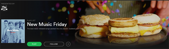 Here, you can plainly see the only emphasized text is New Music Friday, but, off in the background, we have a picture similar to the one promoting all day breakfast from the website. In this way, McDonald's not only affects the viewer by showing them sandwiches, but they may have a connection to that type of image, (whether it be from the site or other advertising) and so, without even using words, the idea of McDonald's all day breakfast is planted in your head, and in such a way that you may not even think about it.
Speaking of using words, one example of McDonald's using them in an influencing way is in their app. 
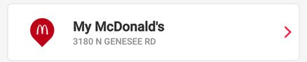 The first task you're chosen for is that of picking a McDonald's close to you, after you've done this, the app refers to it for you as "My McDonald's" immediately humanizing and localizing it.On top of this, your name is displayed at the top of the app at all times with a cheery greeting. In this way, the app emotionally influences the viewer to again, associate McDonald's with small, and local, as opposed to a huge corporation.
 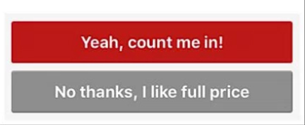 Along with this, the app uses phrases like "my and your" a lot, a way of making the experience feel tailored to the user, and thus, engage with not only the app, but also McDonald's as a brand. Another small but notable example of vocabulary choice is, when the user is prompted for deals and coupons. Look at the options. Albeit funny, it's pretty clear which route seems correct, and after all, what was the point of getting the app if you aren't going to nab a sick deal on a McGriddle?
The last point we have today is arguably the most important. Let's take a look at McDonald's social media presence, twitter in particular. In this day and age, staying relevant can be difficult, especially when it comes to the downright breakneck pace things travel on the internet. So, how does a company that's been around since the 50's remain culturally talked about online in communities that weren't even invented until decades after its inception?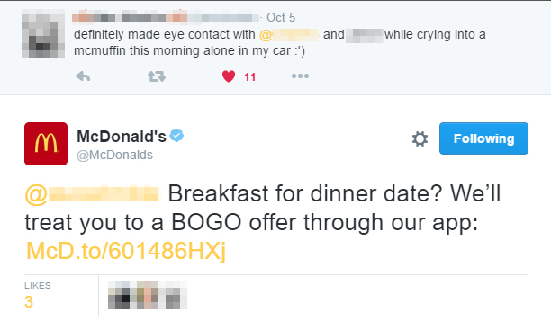 Well, if you look at the tweeting habits of McDonald's, you'll find that while most of the are pretty relevant, hopping on and off trends at appropriate times, they don't seem all that special at first glance. It's when you take a deeper look; however, that the answer is revealed. Response. McDonald's social media awareness isn't fantastic because they tweet a lot, it's fantastic because they know perfectly how to target their audience on a specific platform. In this case, twitter. On top of being hip, McDonald's FREQUENTLY responds to people when tweeted at, and this, is the key to their success online. They know that the people of twitter will engage much better with an interactive company that takes an interest in them, as opposed to one that sits submissively on the sidelines without responding to consumers.
Do you have adlblock? If so, any ad on this page meant nothing, because you didn't even see it. And then, what if you had? You would have skipped over it, or, if it was a huge banner ad, it would have become white noise. Ads are increasingly less impactful, especially online, and McDonald's knows this. So, by responding people, not only do they get a two way interaction, appear relevant, and seem hip, it's also free advertising. It pulls people in, how cool is it to be able to say that MCDONALD'S a company all over the world that has over three MILLION FOLLOWERS responded to your tweet? Very, very cool. On top of this, it acts the same way as many other things in the MD repertoire, it humanizes them. It makes them feel more like a celebrity with great fan engagement than a giant corporation.
All of things McDonald's does with their website, their app, and their social media, they all point towards a goal is to make you buy their food. By looking at all the ways they influence people, you get some of that choice back, some of your ability to decide for yourself whether or not you choose to indulge.
Now, if you'll excuse me, I'm going to go get a McGriddle, because for some reason...McDonald's sounds really good right now.